Prostitution in the US: the Data
An exercise in data journalism that I ended up sharing with you

Note: This is the first of several installments. Part 1 (this part) explores the dataset, Part 2 looks at the ethnicity of sex workers, part 3 looks at the services performed and how this correlates to ethnicity, part 4 looks at the economic side of things and how fees correlate to ethnicity, services and looks of sex workers.
There’s a website I won’t name (goes by the TER acronym) where people (mostly guys) review sex workers (mostly females) for the benefit of other customers. I figured I could use this as an exercise in data journalism and visual storytelling, two topics that have intrigued me for some time, albeit I don’t have a ton of time for them (my day job is in a totally different industry).
Important Note: I fully realize that the subject of prostitution is very sensitive and can be touchy to many. Feminists are split over it: some will argue that it’s the greatest example of men exploiting women, while others will argue that, in cases where violence and human trafficking is ruled out, nobody has the right to tell independent women what she should do with their bodies. As long as its their choice, they are free to get money out of bored wealthy people and put that cash back into an always suffering economy.
For the purpose of this blog, I simply won’t go there. I’ll just illustrate the data I have collected, “sanitized” and organized; and leave the many possible narratives out of it.
Let’s Explore the Dataset and Clean the Messy Data
Initially, the hardest part of the project was obtaining the precious data that TER users have provided over the past four years in a nice tabular format.
I’m a techie, so I overcame that hurdle. Unfortunately (or maybe not), that was only the beginning. I got a bit more than I bargained for as the data required a great amount of sanitization to extract meaningful views and allow “apple to apple” comparisons. It was hugely instructive, though.
To analyze the TER data, I decided to use Jupyter (no pun intended) Notebook, one of the tools of choice for data scientists around the globe.
I won’t go into the details of how I got the data, but trust me, I got it into a nice TSV file:


Now that the data looks a bit cleaner. It will be a pleasure to work with it.
Note: I will show the Python/Pandas code I have used to slice and dice the data, as well as the MatPlotLeab/Seaborn instructions I used for the DataViz. Corrections and questions in comments are welcome.
Guys and Dolls
Let’s first see how many dudes or ex-dudes (transsexuals) are hiding among the dolls. Fortunately, we have a field that provides that information. Visualizing is easy, so there are no surprises. About 2%.

Fuckers of the world unite!
Let’s have a look at where those fuckers are hiding (pun intended this time).
To be honest, this could use some consolidation, as US big cities don’t always include metro areas which are important enough to show up near the top of the list. I’m thinking of Edison, NJ and Brooklyn, vs. NYC, or Tysons Corner and Fairfax vs. Washington DC. (And to be clear, I am not trying to imply that them fuckers in DC are having a disproportionate amount of fun as compared to the rest of the country… or maybe they do?)
plt.figure(figsize=(10,18))
frame[‘City’].value_counts()[:40].plot(kind=”barh”);
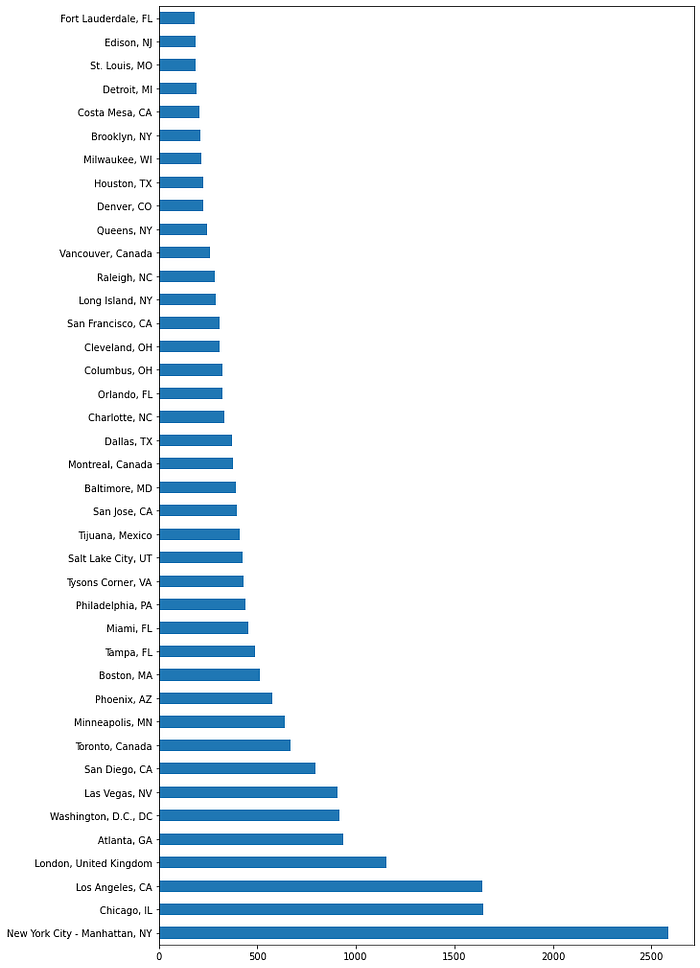
Unsurprisingly, New York City, Los Angeles and Chicago are the three top cities also as far as prostitution in the US goes.
It would be nice if I could look at country state level. I need a bit of manual work here to normalize the data. I won’t bore you with the details. “Data people” will get a sense of what I did from the following:


Let’s take a look at how Americans get down to it across the nation.
Unsurprisingly, California has a lot of californication going on. At the same time, them guys in Montana don’t appear to mount much.
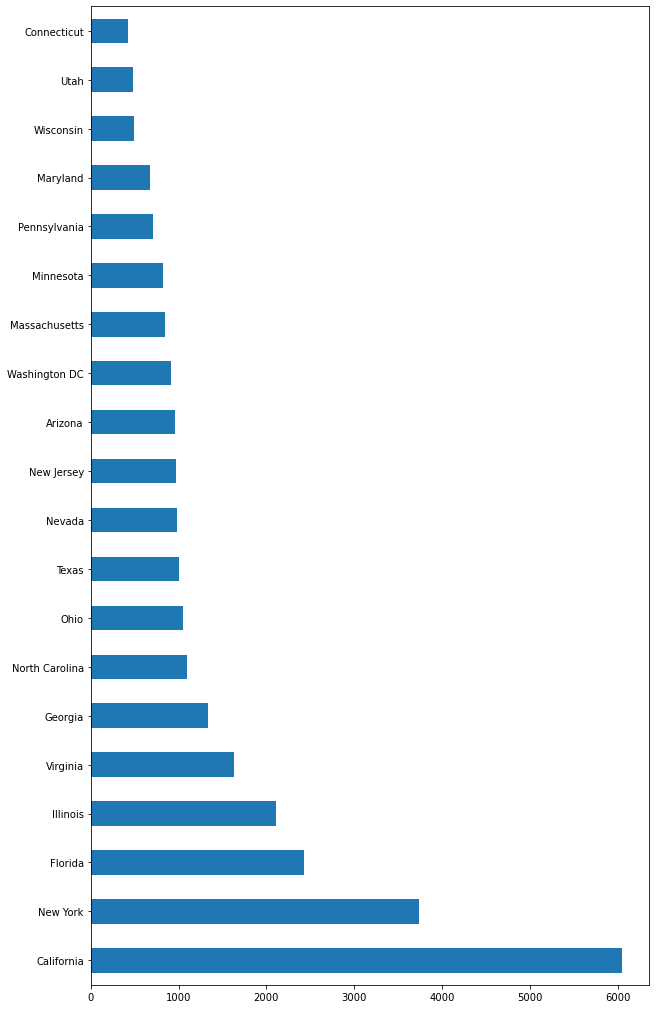
Washington DC has a disproportionally high position considered its size. Should we conclude that size doesn’t matter when it comes to sex work?
Noteworthy: there aren’t that many virgins in Virginia apparently.
What about other countries?
TER is a US website. We can expect the overwhelming majority of our data to refer to the US. A quick query (a quickie?) reveals that 90% or so of the data refers to the US in fact.
plt.figure(figsize=(10,6))
frame['Country'].value_counts()[:10].plot(kind="barh");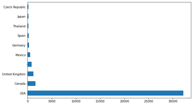
This is an important aspect in our dataset. While we may get some insight into prostitution in other places, it’s the US that deserves the focus (no pun intended) here.
That’s it for now. In the next installment we will look at sex workers (AKA providers in TER lingo), starting with their ethnicity.
